UX Professional Learning Hub
Project Summary
Learners is a pioneering EdTech company that is transforming the UX industry through live-streamed events and curated conferences.
After experiencing a 95% churn rate on the landing page of its mobile app, the company decided to redesign the app to serve a more focused target audience: students. My team was brought in to understand the needs of these students and recommend design solutions that would best address those needs.
My Team
Three UX Designers
Senior UX Researcher Mentor Ron Piell
My Role
Lead UX Researcher
As the team's most experienced researcher, I took the lead in developing the research plan, conducting eight of the 11 interviews, designing survey questions, and creating user journey maps.
Additionally, I collaborated with my teammates to recruit interviewees, analyze responses, synthesize research findings, and deliver the final presentation.
Team facilitator
I prepared meeting agendas, led weekly team meetings with Learners' CEO and the mentor, and took notes for the team.
Deliverables
The final presentation included:
Competitive Analysis
Survey Analysis
User Journey Maps
Application Preview
Impact
By challenging the company's assumptions, I identified a new group of customers with similar needs—bootcamp participants—and added them to the target audience.
My team and I defined the direction for redesigning the mobile application to serve the new target audience.
My Approach
The Learners' CEO, Alec Levin, presented the following assumption to my team:
Our team agreed that students are a good target audience, as valuable resources are likely to spread quickly among peers with similar career interests.
However, I challenged his belief that students have the greatest need for an external resource, because they already have access to school-based resources like professors and alumni. I had an assumption that UX bootcamp participants—who are looking to transition into the UX industry but can't fully commit to formal education—might have an equally strong need for a resource like Learners.
While accepting the CEO's request to understand students' needs, I proposed testing my assumption for the following reasons:
Bootcamp participants represent a large group of potential users at similar career stages.
Bootcamp participants and alumni often have strong networks with shared interests in UX.
If their needs align with those of students, including them as a target audience could expand the user base with minimal additional effort.
The CEO and my team welcomed this suggestion, and we decided to include bootcamp participants in our study.
Research Questions
How might we effectively support students and bootcamp participants who aspire to work in the UX industry?
To answer the main question, we prioritized addressing the following sub-questions:
What are the learning needs and interests of students and bootcamp participants?
What features will motivate them to download the app?
How are they currently learning?
Methods
Weekly CEO Interviews
I determined that understanding the company's priorities and previous research findings through direct communication with the CEO was crucial, especially since this was our team's first project with Learners.
Competitive Analysis
My team focused on identifying Learners' strengths and weaknesses, compared to competitors that UX students use, and services that our target users desire but competitors don't offer.
11 Moderated User Interviews
We initially interviewed eight undergraduate and graduate students in Human-Computer Interaction and Human Centered Design and Engineering. I believed in-depth interviews would be an effective method to understand not only the students' needs but also the reasons behind them.
I attended UX networking events to better understand the needs of UX bootcamp participants and recruited two bootcamp participant interviewees.
We also interviewed a UX professional who provides portfolio reviews to students, validating our findings through a third party who frequently interacts with students.
Survey: 151 Entries
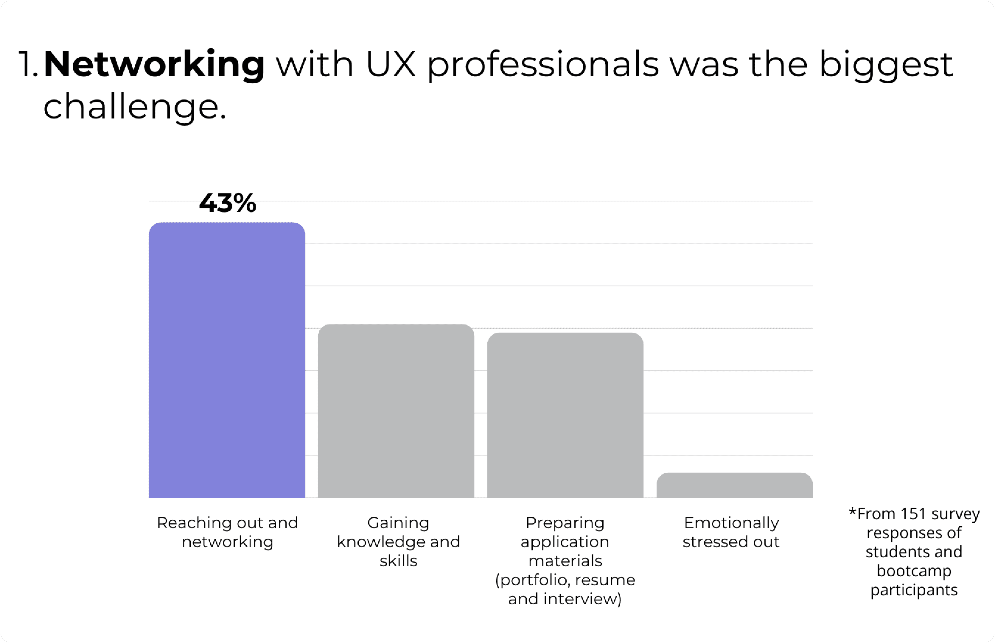
We received survey responses from students and bootcamp participants to quantify insights from the interviews and validate our findings.
Insights
[ Takeaways from Interviewing the CEO ]
The company’s primary focus is on providing free, scalable services to users.
User engagement—measured by frequency of use and time spent on the product—is a key performance indicator (KPI) for the company.
Based on these priorities, I worked with my team to develop recommendations that align with the company's goals.
[ Competitive Analysis Findings ]
Learners' Strengths:
The company has a strong network of UX professionals who deeply value the brand, as demonstrated by their involvement in conferences.
Learners' Weaknesses:
The company lacks strong brand recognition among students.
The features and content offered do not align with the needs or preferences of the student audience.
High-quality content on the app and YouTube is not easily searchable or optimized for quick consumption on mobile devices.
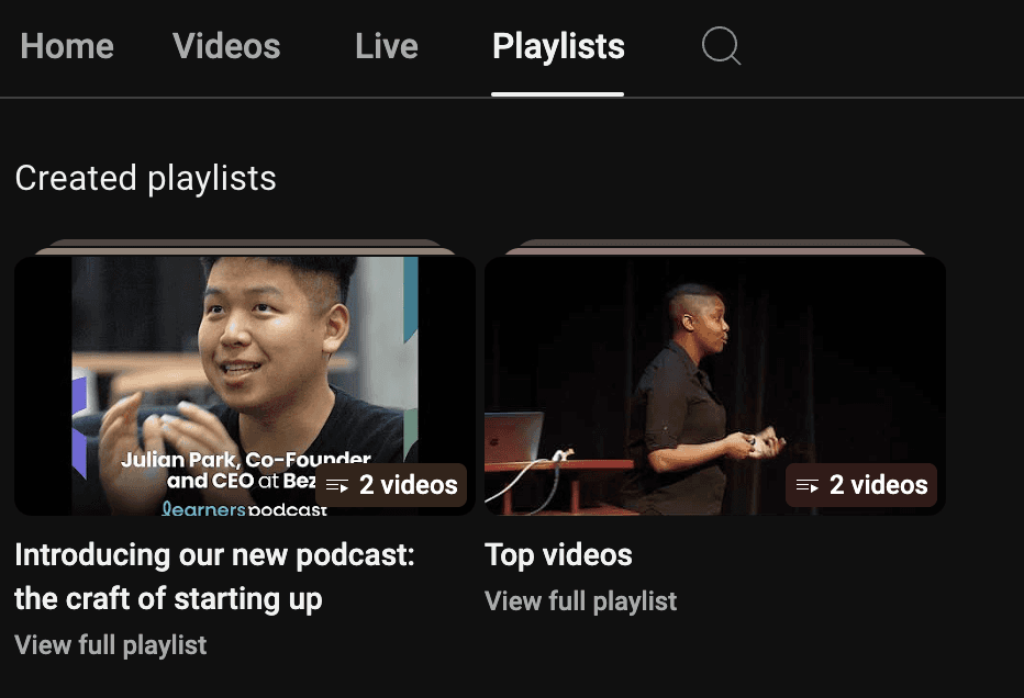
Learners' 100+ videos were organized into just two playlists, with many of them being over 30 minutes long. This made it difficult for users to find content by topic and watch on mobile.
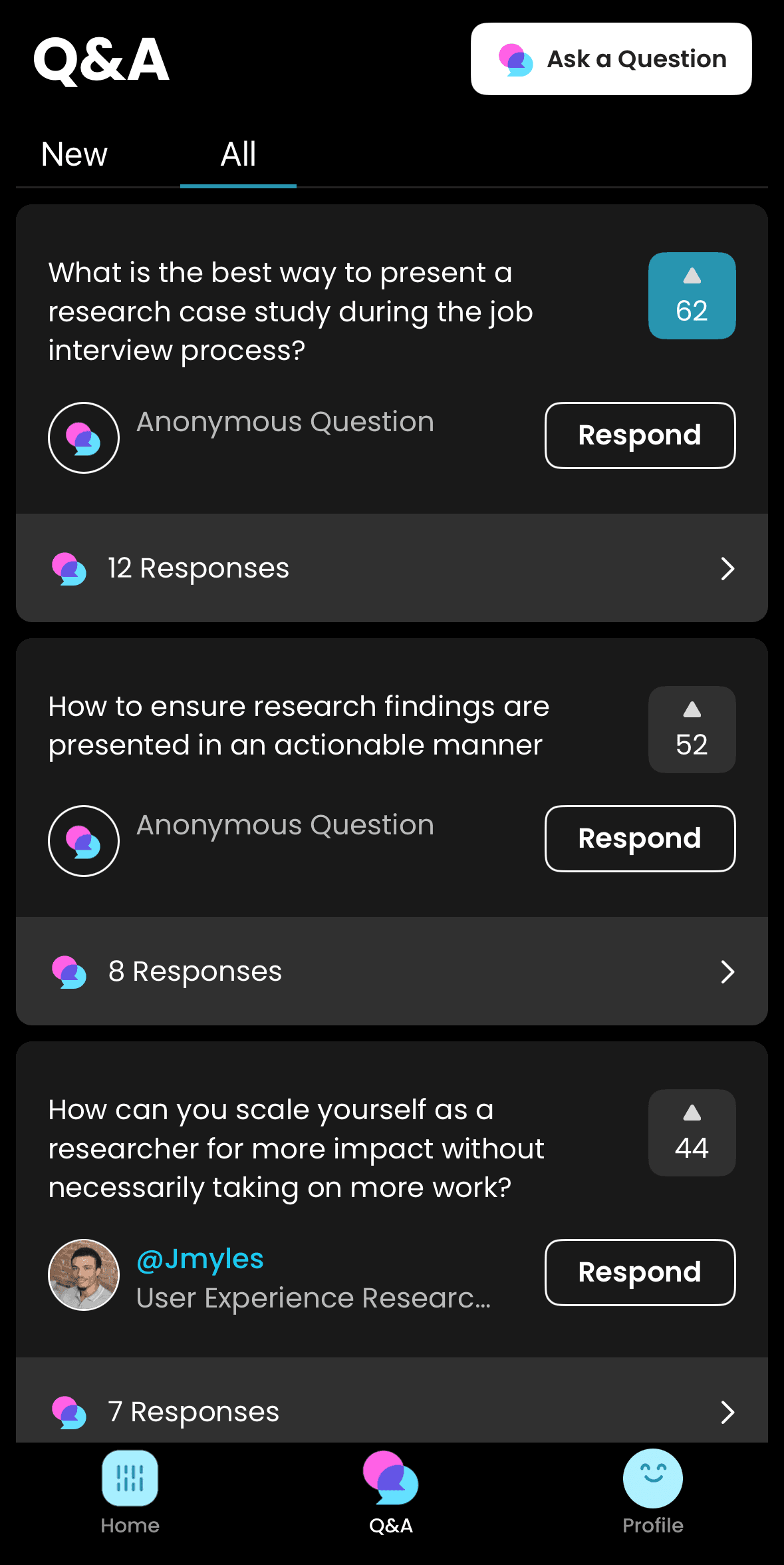
Users can't search for specific questions and must scroll through the list to find what they're curious about.
I focused on strategies that build on the company's strengths while addressing its weaknesses.
[ Insights on Target Users and Key Recommendations ]
Pain Point 1
Students hesitate to reach out to UX professionals
Pain Point 2
UX professionals often do not respond to cold messages

Many struggled with creating a UX portfolio.
Pain Point 3
Users are unsure how to apply general tips to their case studies
Pain Point 4
Users receive inconsistent feedback from different mentors
The insights have guided the direction for the mobile application redesign, highlighting specific features to target in the coming years.
After the final presentation, the CEO mentioned that offering public portfolio reviews was a scalable feature his team hadn’t expected students to want, but they would like to prioritize it in the new app.
I identified a new group of target users—bootcamp participants—with similar needs, enabling the company to expand its potential user base with minimal cost and effort.
Plan ahead to prevent AI from manipulating survey results
As a result of offering a monetary incentive and distributing the survey publicly on LinkedIn, we received hundreds of responses generated by AI bots using fake accounts. To address this, I implemented reCAPTCHA, added validation questions, and randomized the question order. I also spent considerable time manually removing bot-generated responses. Next time, I will implement stricter screener and validation processes, and take proactive measures to prevent similar issues.
Become a domain expert to give recommendations that stakeholders find helpful
Although my team conducted secondary research, we may not have delved deeply enough from the perspective of stakeholders with extensive experience in the EdTech field. A more thorough understanding of both UX and EdTech would have allowed us to generate more valuable insights and build stronger trust with stakeholders. Moving forward, I will prioritize gaining a deeper understanding of the domain to ensure our insights are grounded in a more comprehensive context.


